Non-Western Exhibit

Ukiyo-e (浮世絵) prints and paintings date back to the 17th century, and lasted up until the 19th century. Edo (present-day Tokyo), served as a hub for artists to create and sell their art, and the style and subjects of these pieces of art ranged and varied dramatically.

The word “ukiyo-e” means “pictures of the floating world” (broken down: 浮 – floating, 世 – world, 絵 – picture(s)), and refers to the popular style of woodblock printing prominent in East Asia.

Takiyasha the Witch and the Skeleton Spectre by Utagawa Kuniyoshi; Japanese Title: 相馬の古内裏 妖怪がしゃどくろと戦う大宅太郎光圀


This first piece by Utagawa Kuniyoshi (歌川 国芳) (3, 6) depicts Takiyasha, a princess from the 10th century, summoning a skeleton spectre to scare away Ōya no Mitsukuni, a Minamoto samurai. You can see Princess Takiyasha reading off a scroll to summon the large skeleton, and Ōya no Mitsukuni staring into the face of the skeleton with his companion ducking away from it. Ōya no Mitsukuni is known in the story/mythical lore that this picture is based on as an hero that was able to defeat the skeleton spectre and Princess Takiyasha.

I chose this piece to showcase first because I had never seen something like this depicted in ukiyo-e before. Whenever I have heard or learned about the subject in school, I was always shown the weird-drawn people or landscapes that feature Mount Fuji or the famous Giant Wave print. It surprised me to see such a thing as this, I and knew I had to include it in my exhibit. Through this picture, was able to learn something new about Japanese lore that I had not known before.

Hawk, vertical format by Utagawa Kuniyoshi


This piece, also by Utagawa (6), shows ukiyo-e in the vertical format. Not much was written about this piece as far as history or context, but I chose this pieces because of the colours and subject matter.

The hawk in the work was painted to be quite realistic. The details and work put into this piece make it so that the hawk has its individual feathers defined. The face is intense, and I think the red on either side of its head makes it stand out even more. The leaves and foliage on the tree also have a lot of detail and thought, and it feels as though the hawk will fly off the branch any moment, and the some of the leaves will fall off and land on my desk. Having it painted in a vertical fashion really complimented the composition.

日本語: 観楓図屏風 English: Maple Viewers Muromachi – Azuchi-Momoyama period, 16th century


This piece is six vertical pieces put together to create one big picture/scene. “In the foreground, samurai, monks, and ladies enjoy a drinking party at a famous spot for viewing the autumn leaves on the banks of the Kiyotaki River in the Takao area of the northwest outskirts of Kyoto. In the left background we see snow-blanketed Mount Atago, and in the right background are the buildings of the Jingoji Temple” (4). Painted by non-monk Kanō Hideyori (狩野秀頼), this was one of the original works from what started from “Chinese paintings,” works from the Song Dynasty that depicted Chinese landscapes. When Japanese artist began using this style, they were usually exact copies of the original. The monks later began to create more original works and creating and establishing their own styles. Kanō is known for his lively and bright colours.

This piece reminds of me of the art from the Romantic era, where Western artists painted scenes from life. Often people who were in parks sitting in the grass having picnics and enjoying some the good weather. This piece differs in that it looks like a map, showing general locations in a not-to-scale fashion. I really like the colours and how they seem to grow out of the brown surroundings.

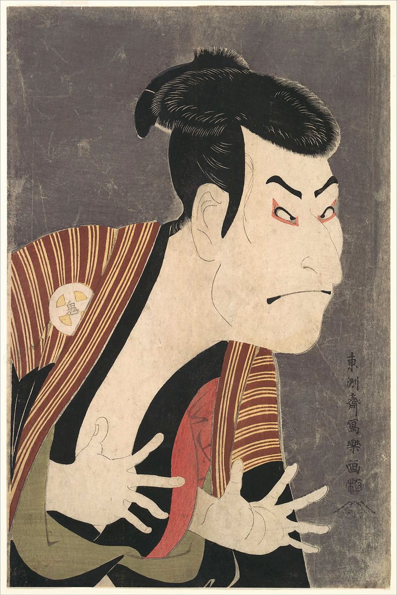
Oniji Ōtani III (aka. Nakazō Nakamura II) as Edobee in the May 1794 production of Koi Nyōbo Somewake Tazuna at Edo Kawarasaki-za theater


Here in this piece, “Otani Oniji II is captured here in the role of Yakko Edobe. A yakko is a manservant often used by samurai to perform violent deeds” (5). Otani Oniji was an actor in the theatrical art form of kabuki (歌舞伎). Sharaku Toshusai, the artist, was very well known for his dramatic depictions and vivid colours in his art. 

The thing that stands out to me about this piece is the detail in the hair. It’s the first thing my eyes jump to when I look at it. Then I look at the face. I think for most people, they would notice the face first because it’s so wacky looking and silly. It makes me wonder how close the resemblance is to the real actor, and if he often look silly like this.

For more ukiyo-e paintings, there is an extensive gallery here. Enjoy!

1. “Artists by Movement: Ukiyo-e – Images from the Floating World.” Artcyclopedia. Web. 25 Apr. 2015. <http://www.artcyclopedia.com/history/ukiyo-e.html>.

2. Department of Asian Art. “Woodblock Prints in the Ukiyo-e Style”. In Heilbrunn Timeline of Art History. New York: The Metropolitan Museum of Art, 2000–. http://www.metmuseum.org/toah/hd/ukiy/hd_ukiy.htm (October 2003)

3. “A Brief Biography of Utagawa Kuniyoshi.” Kuniyoshi Project. Web. 25 Apr. 2015. <http://www.kuniyoshiproject.com/Kuniyoshi Biography.htm>.

4. “Overview of Painting of The Muromachi Period (1333-1568).” Web Japan. Web. 25 Apr. 2015. <http://web-japan.org/museum/painthist/phmuroj/phmuroj.html>.

5. “Toshusai Sharaku: Otani Oniji II” (JP2822) In Heilbrunn Timeline of Art History . New York: The Metropolitan Museum of Art, 2000–. http://www.metmuseum.org/toah/works-of-art/JP2822. (October 2006)

6. “Utagawa Kuniyoshi.” Ukiyo-e. Web. 25 Apr. 2015. <http://ukiyo-e.org/artist/utagawa-kuniyoshi>.

Post Modern Contemporary Virtual Exhibit: Deconstruction

A major aim of the Post Modernist movement was, and still is, to break down preconceived notions of what art is an isn’t, and to tear down barriers. A major barrier that the Post Modernist movement broke was the barrier between “high” and “low” art, stomping the notion into the ground repeatedly, refusing to let something they as artists felt were untrue and limiting to keep them from making the art they wanted and the statements they wanted (and needed) to make.

Photograph of Bits & Pieces Put Together to Present a Semblance of a Whole, by Lawrence Weiner, laser-cut aluminum typography on brick. Walker Art Center, Minneapolis, Minnesota. 2005.

This piece by Lawrence Weiner falls in the category of Conceptual Art, an art form actively challenging what makes art “art.”
It’s simple, aluminum on a brick wall of a building, but the words convey something deep and thought-provoking. Weiner is “a sculptor whose medium is language. His texts describe material processes and physical conditions; they delineate space and indicate location” (1).

Untitled by Barbara Kruger. 1985.

I like this piece in particular because it’s conveying an important message not just with pictures, but with words on the pictures itself. Not only that, but this piece is nine different pictures displayed and made to be one big piece of art. The words on the pictures help make the whole piece come together and makes sense of what the message was supposed to be conveyed.
Another Conceptual Artist, Barbara Kruger’s art often depicted “addressing cultural constructions of power, identity, and sexuality” (2).

The Blue Ghost by Samizu Matsuki. 1976.

Japanese artist Samizu Matsuki’s “significance was in her returning the techniques of Western Classical Realism painting, as refined by Japanese art schools since the 19th century, back to the West. In the early 1970s she created a series of award winning works before a spinal injury and later, Lyme Disease” (3).
This piece is an example of Classical Realism, a movement in the late 20th century to bring back art styles that focus on skills, talent, and beauty. Even though this work references an old art style from the 19th century, I feel that this fits the deconstruction theme I’m going for. I feel that this piece shows that things that are considered old and traditional aren’t always bad, if bad at all. While traditional things and thinking may not work for the world we live in now, there’s not reason to throw away our traditions completely.

Untitled by Minoru Ohira. 2007.

This piece is interesting in that it was not made of the traditional media with we are familiar. This piece was made out of coffee, black powder, and pencil on Japanese paper. The artist, Minoru Ohira, is known for his sculptures being made out of things he can find like wood, slate, and graphite. He also makes things using resin, and mixes the materials together to make interesting sculptures (4). When he makes paintings or drawings, they are often made using Japanese paper in interesting ways:

Moon in Water by MInoru Ohira. 2009.

This piece, also by Ohira, was made by layering Japanese Paper, powdered paint, graphite, and silver leaf (5).
I find that these pieces by Ohira follow my theme of deconstruction because who would have thought to use coffee to create a piece of art? Mixed media can include anything the artist can think to use.

Young Baggage by John Chamberlain. 2005.

“John Chamberlain was an American sculptor who trained in Chicago. After initially working with iron pipes, Chamberlain started to explore the possibilities of twisted metal sheets” (6). He has made many sculptures out of cart parts, buying cars from closing collections or museums to contribute to this works.
Before Post Modernism, what constituted as a sculpture usually meant using bronze, marble, stone, or some other kind of alloy and it was usually in the form of a human, deity, or an animal. This kind of sculpture by Chamberlain completely changed what it meant to make a sculpture.

Many Post Modern artist utilize various media to create their art, something not really done in the art movements before Post Modernism. There seemed to be the thought that if it’s not paints on canvas or pen/pencil on paper, how could it possibly be art? These Post Modernist artist have proven over and over that art isn’t always what one thinks it to be.

1. Spector, Nancy. “Lawrence Weiner NACH ALLES / AFTER ALL.” Guggenheim. The Solomon R. Guggenheim Foundation. Web. 12 Apr. 2015. <http://www.guggenheim.org/new-york/collections/collection-online/artwork/11207>.

2. “Barbara Kruger (American, Born 1945).” MoMA. Oxford University Press, 1 Jan. 2009. Web. 12 Apr. 2015. <http://www.moma.org/collection/browse_results.php?criteria=O:AD:E:3266&page_number=1&template_id=6&sort_order=1&displayall=1#skipToContent>.

3. “About Samizu Matsuki.” Samizu. Web. 12 Apr. 2015. <http://www.samizu.com/samizu_about.html>.

4. “Gallery.” MINORU OHIRA. Web. 12 Apr. 2015. <http://www.minoruohira.com/gallery.htm>.

5. Calvin-Morris Gallery. Web. 12 Apr. 2015. <http://www.cavinmorris.com/minoru-ohira/>.

6. Hufkens, Xavier. “John Chamberlain.” Calvin-Morris Gallery. Web. 12 Apr. 2015. <http://www.xavierhufkens.com/artists/john-chamberlain>.

The Influence of World War I on the Arts during the Early Modern Era

“The Great War of 1914-18 tilted culture on its axis, particularly in Europe and the United States,” (1) where there had once been a life where things were, for the most part, predictable and easy to understand, and change was slow to come and influences came gradually. All of a sudden, the (Western) world was torn apart, and no one could be sure what would happen next. Despair and hurt covered everything, and the reality of the Great War seemed to have pulled the sheet that had been covering everyone’s eyes, that had kept them from truly acknowledging the tensions and problems that led up to the war, something they felt sure couldn’t happen because too many things would have been at stake. Impressionism, within the overarching Romantic Era, was the last major movement before Early Modernism. With the war came Modernism, a jaded, intellectual, philosophical movement fueled by disillusionment, the frustrations and fascination with industrialization, uncertainty, lack of religious belief, and the sciences. Modernist found that what had been traditional, so safe and familiar, was not going to work anymore in the new world they were living in.

Amiens, the key to the west by Arthur Streeton, 1918

This piece by Arthur Streeton is a landscape painting of Amiens, Picardy, France, the location of the Battle of Amiens and a part of the Western Front for the Allies. This painting shows the natural state of Amiens; lush with green with farm homes in the foreground. The sky is blue and full of clouds, though it is peculiar how vertical they are, as if they originated from the ground. This depiction of Amiens contradicts the actual conditions the soldiers endured. Heavy use of trench warfare occurred here during the Battle of Amiens. A recount from soldier Gunner J.R. Armitage goes:

“It was utterly still. Vehicles made no sound on the marshy ground … The silence played on our nerves a bit. As we got our guns into position you could hear drivers whispering to their horses and men muttering curses under their breath, and still the silence persisted, broken only by the whine of a stray rifle bullet or a long range shell passing high overhead … we could feel that hundreds of groups of men were doing the same thing – preparing for the heaviest barrage ever launched” (2).

Arthur Streeton was a “commissioned honorary lieutenant and appointed official war artist in 1918, he spent two periods in France documenting the Western Front for the Commonwealth government” (3). The style in which he painted this piece feels surreal, like a dream, as there aren’t any defined lines or subjects besides the land itself. In a place like this, in a style likes this, how could something as horrifying as trench warfare ever occurred here?

Blumenmythos by Paul Klee, 1918

Blumenmythos by Paul Klee features geometric shapes and vivid colour, things inspired by Cubism and his time in Tunisia, where “the limpid light of North Africa awakened his sense of color” (4). The single bird in the painting, seeming to be flying or falling downward toward the flower was inspired by Klee’s time as a solider during World War I. The bird “mirror[s] the flying and falling planes he saw in Gersthofen, and the photographed plane crashes” (5). I feel that the red could very well represent the bloodshed of millions of people that died during the war, and the bird falling is that sense of confidence in one’s own ability and surroundings being destroyed and let to fall to the ground to waste away. The flower that sits in the middle of the piece seems to be waiting for the bird to fall into it, reaching up to meet it. Something so beautiful turns out to be so horrible, which is why I find the title of this piece Blumenmythos, or Flower Myth in English, fitting.

Shop for Machining 15-inch Shells by Anna Airy, 1918, England

This last piece differs from the other two in that it depicts something directly about the war. Shop for Machining 15-inch Shells by Anna Airy was “commissioned in June 1918 by the Munitions sub-committee of the Imperial War Museum[.] Airy’s paintings were intended to stress the impact of ‘total war’ on British industry and the huge production effort required to wage war” (6). Airy, one of the first female artist to be commissioned during the war, was put under extreme conditions in order to create her paintings. Not only that, but her contracts were often very strict and restricted her in ways that her fellow male painters were never subjected to. “Regardless, Airy applied herself to her commission with determination, visiting major factories and forges throughout Britain. This often meant placing herself in harm’s way. During one visit to the shell forge at Hackney Marshes, the extreme heat of the shop floor burnt through the soles of her shoes” (6).

The painting itself leans more in a realistic style, as it is supposed to depict the average day in the forges and factories. However, there aren’t any defined outlines or breaks for the objects in the painting. In this way, things seem to blend in with each other a little bit. Some of this can be justified. Because of the extreme and dangerous conditions Airy was often exposed to, she found that she had to paint as quickly as possible while also retaining a certain level of quality about her work, all while making sure she stays aware of her surroundings so that she doesn’t get injured. To get something like this in the end really shows Airy’s passion and determination, as well as her professionalism.

1. Johnson, Reed. “Art Forever Changed by World War I.” Los Angeles Times. Los Angeles Times, 21 July 2012. Web. 2 Apr. 2015. <http://articles.latimes.com/2012/jul/21/entertainment/la-et-cm-world-war-art-20120722>.

2. “The Battle of Amiens: 8 August 1918.” Australian War Memorial. Australian War Memorial. Web. 2 Apr. 2015. <https://www.awm.gov.au/exhibitions/1918/battles/amiens/>.

3. Ann E. Galbally, ‘Streeton, Sir Arthur Ernest (1867–1943)’, Australian Dictionary of Biography, National Centre of Biography, Australian National University, http://adb.anu.edu.au/biography/streeton-sir-arthur-ernest-8697/text15219, published first in hardcopy 1990, accessed online 2 April 2015.

4. Rewald, Sabine. “Paul Klee (1879–1940).” Heilburnn Timeline of Art History. The Metropolitan Museum of Art. Web. 2 Apr. 2015. <http://www.metmuseum.org/toah/hd/klee/hd_klee.htm>.

5. “Paul Klee.” Art Forgers. Art Forgers. Web. 2 Apr. 2015. <http://www.artforgers.com/sw2.cfm?q=Paul_Klee>.

6. “War Art: Shop for Machining 15-inch Shells (1918).” The Telegraph. The Telegraph, 1 Nov. 2013. Web. 2 Apr. 2015. <http://www.telegraph.co.uk/history/world-war-one/inside-first-world-war/part-three/10417628/war-art-munitions-production.html>.

Romantic Impressionism

I personally find Impressionism to be thought-provoking and more emotionally connecting than art from previous periods. Many pieces from this era are in the style of not having defined lines or subjects. These artists were more focused on the colours and feelings than lines and contours.  I feel that these characteristics of Impressionist art makes it easier to connect with emotionally, and also part of the reason that so many people are familiar with pieces from this era of art.

J.M.W. Turner – “Rain, Steam and Speed” 1844

J.M.W. Turner – “The Slave Ship” 1840

These two pieces by J. M. W. Turner show his “imagination were to be found in the subjects of shipwrecks, fires (such as the Burning of Parliament in 1834, an event which Turner rushed to witness first-hand, and which he transcribed in a series of watercolour sketches), natural catastrophes, and natural phenomena such as sunlight, storm, rain, and fog. He was fascinated by the violent power of the sea, as seen in Dawn after the Wreck (1840) and The Slave Ship (1840)” (1). Turner’s fascination with things of nature was reflected emotionally through his oil paintings. In Rain, Steam, and Speed”, the rain seems to be coming out of a cloud of fog, and where the train begins and ends is indistinct, as it blends with its surroundings. It’s hard to see where anything begins in ends: where is the sky, and where is the ground? Where is the rest of the train? It makes the viewer think and imagine what else could be going on in the painting. “The Slave Ship” was painted to show the harshness of the sea, and in the foreground, indistinct, grotesque shapes of human corpses float in the water. This painting also shows the reality of diseases spreading on ships back then. Those affected had to be thrown over board as so to not get the rest of the crew fatally sick (2).

Jan Brueghel the Elder “A Woodland Road with Travelers” 1607

Jan Brueghel the Elder “The View of Heidelberg” 1588-89

These two works by Jan Brueghel the Elder, the son of Pieter Brueghel the Elder, were done during the Baroque era of art. He was very talented in painting flora and fauna, and “when flowering plants had run their course around August, landscape season began. Called “Velvet Brueghel” for his skill at painting rich and delicate textures, Brueghel was the second generation in a dynasty of Flemish painters. Born in Brussels and trained by his grandmother, Brueghel was celebrated in his own time, becoming dean of the Antwerp painters’ guild by 1602″ (3).

These two paintings by Brueghel are of landscape or scene, and already one can see the difference between Jan Brueghel the Elder and J. M. W. Turner. In Brueghel’s paintings, the humans in his work are distinguishable from their surroundings. The trees have a very detailed texture, and it’s easy to understand what is happening in the first painting; in the second painting, the clouds in the sky do not have defined lines, but the castle and other structural objects (as well as the land) have defined lines and boundaries. To me, Brueghel’s paints feel like stated facts: this is what it is, and there’s not much else to interpret from the work. In Turner’s paintings, it’s not so easy to see what is going on, and his works do not feel like stated facts. To me, his paintings are about perceptions, and hidden truths among the blended colours and subject matters.

1. “Joseph Mallord William Turner Biography.” William Turner. Web. 22 Mar. 2015. <http://www.william-turner.org/biography.html>.

2. Landow, George P. “J. M. W.Turner’s Slave Ship.” Images of Crisis. 15 July 2007. Web. 22 Mar. 2015. <http://www.victorianweb.org/art/crisis/crisis4e.html>.

3. “Jan Brueghel the Elder.” The J. Paul Getty Museum. Web. 22 Mar. 2015. <http://www.getty.edu/art/collection/artists/686/jan-brueghel-the-elder-flemish-1568-1625/>.

The Baroque Era – Rembrandt Sketches

Rembrandt Harmenszoon van Rijn was a painter and draftsman during the Baroque era and during the Netherlands’ Golden Age of the arts and science. His style was quite realistic in presentation, and he “regarded his drawings the way a novelist regards the ideas he jots down in his journal–as a purely private record of observations and feelings” (1). He studied at the prestigious University of Leiden even though he was a miller’s son, but soon dropped out to pursue a career in doing art (2). He had chosen to go to Amsterdam to pursue his goal of becoming an artist instead of going to Italy like most mentors recommend for those aspiring to be an artist.
In Amsterdam, he found great success. The Netherlands were different from Italy in that there wasn’t a rich or prominent figure (such as the church) to commission artists. Instead, there was a rising, influential merchant class (2) there to buy and sell paintings, allowing lower class people access to art such as Rembrandt’s.

The defining thing about Rembrandt’s work is the level of detail and how realistic his paintings can be. His attention to details, especially the small things, is what makes his paintings stand out from others. An example would be how he uses chiaroscuro, the use of dark and light values that create a stark contrast. Rembrandt takes the technique and applies in in a very subtle way in his paintings; he creates contrasts in the minute details of his work, such as using shadows underneath the eyes or in the folds of skin or clothing, to make the subject feel as though it was lifted from the paper. To get to this level, and to be able to do the paintings that he does, studying from life was vital, and Rembrandt took personal pleasure in using the people and his surrounds as a means to further his skills. This is where is sketches (etches as they were called in his time) play an important role.

Man Pulling a Rope, 1627-1628

A self-portrait, mid-1630s

A Woman Sitting Upon a Hillock, 1631

These three etchings differ in level of completeness, style, and purpose. Rembrandt often sketched from life, as he found inspiration in watching people move about. This is evident in the first etching where the man is pulling on the rope. The lines are quick and create a simple form, yet, they hold a feeling something beyond a quick doodle. The form holds a feeling of being ground in reality. His foot looks like an actual foot. The way the man is pulling on the rope gives the viewer the understand of just how heavy the load is; the viewer can almost feel the weight the man is pulling. All of this feeling packed into something that probably took Rembrandt no more than ten minutes, if even that, to complete.

The second etching is a self-portrait of Rembrandt in the early 1630s. Rembrandt often used himself as a model in his works, and later in his life created many self portraits of himself (2). The viewer here can also tell that this etching did not take Rembrandt long to make because of the kind of lines that were formed, their shape, and unrefined look. His hand is very simply drawn, and his coat is not very defined.

The last etching seems to be more of a finished piece than a quick sketch. More effort was put into the work, as the lines are cleaner and more refinded, and was done in ink instead of graphite. Looking at an artist’s sketches are almost just as important as looking at there finished works or paintings. Rembrandt could have never achieved his level of success if he did not draw from life as frequently as he did. He had a personal interest in drawing the things around him, as well was using himself as a model. He chose to stay in his home country because he believed he could achieve his full potential studying from his own people instead of those in Italy. This attitude is how greatness is made.

1. “Rembrandt’s Drawings.” Rembrandt Painting. Web. 22 Feb. 2015. <http://www.rembrandtpainting.net/rembrandt_drawings_start.htm>.

2. “Rembrandt.” The National Gallery. The National Gallery. Web. 22 Feb. 2015. <http://www.nationalgallery.org.uk/artists/rembrandt>.

Avaritia (Greed), 1558

This piece of art work is Avaritia (Greed) by Pieter Bruegel the Elder. Done in 1558, it is a part of Bruegel’s series on the Seven Deadly Sins. In the center of the pictures sits a personification of Avaritia (“greed” in Latin) and the negative consequences of greed. The quote, “Quis metus aut pudor est unquam properantis avari” that is written at the bottom is translated as “Scraping Avarice sees neither honor nor courtesy, shame nor divine admonition.” (1)

About the artist, Pieter Bruegel the Elder was “Netherlandish painter and designer for engravings. His works provide a profound and elemental insight into man and his relationship to the world of nature” (2). He is called the “Elder” to distinguish him from the long line of Bruegels that came after him. One could say that his art style went through three major changes: Antwerp, Mature, and Late.

Works such as Avaritia (Greed) show Bruegel’s penchant of creating a scene that depicted peasant peoples or many actions or events happening in one painting or work. He often created a work with the purpose to tell some sort of story, as he had developed a “style that uniformly holds narrative, or story-telling, meaning” (3). The art style that Avaritia (Greed) was etched in was Bruegel’s “Antwerp Style,” a style he developed after entering under Hieronymus Cock, an Antwerp publisher. Cock at first tried to pass of Bruegel’s work as someone else named Hieronymus Bosch, but with Bruegel’s Seven Deadly Sins series, Bruegel’s name is on the etchings. With the series, “Bruegel was attempting to substitute a new and more relevant eschatology for Bosch’s traditional view of the Christian cosmos” (2).

I feel that this work was a way of reflecting on how Bruegel saw greed in and around his environment. The Reformation had happened during his life time, and at the time, there was a lot of unrest and dissatisfaction with the Catholic Church. There were a lot of contradictions within the church and corruption. I think this was a way of depicting that.
Bruegel did not often depict religious figures or themes in his work, but he did make satire work about such themes. To me, the woman sitting in the foreground of the work represents not only the wealthy, but the high members of the Church. In the work, she has coins spilling into her lap, and her hand is reach into the chest next to her for more coins. There are peasants all around her, and they are naked or in very rugged clothing. The person next to her filling up the chest with coins has a large hole in the vase and a mask on his face. There are deformed peasants off to the right begging for coins. They could represent those who were crippled or disabled in some way and often were very poor and homeless. Chaos seems to be going on all around her, yet all the woman cares about are the coins.

1. “Pieter van der Heyden after Pieter Bruegel the Elder: Avaritia (Greed) (26.72.31)”. In Heilbrunn Timeline of Art History. New York: The Metropolitan Museum of Art, 2000–. http://www.metmuseum.org/toah/works-of-art/26.72.31 (October 2006).

2.  “Pieter the Elder Bruegel Biography.” Pieter Bruegel the Elder. 1 Jan. 2002. Web. 10 Feb. 2015. <http://www.pieter-bruegel-the-elder.org/biography.html>.

3. Pioch, Nicolas. “Bruegel, Pieter the Elder.” WebMuseum, Paris. 16 Aug. 2002. Web. 10 Feb. 2015. <http://www.ibiblio.org/wm/paint/auth/bruegel/>.

Introduction

Hello everyone! I’m Kelly Wilson and I’m a Foreign Languages major, with a concentration in Japanese and German. I’m a military brat, so I have many homes (why just have one?).

I love to write and draw. I’ve recently gotten into animation, and I’m currently self-teaching myself figure drawing and very basic animation (I’m hoping to construct for myself a drafting table or at least a proper light box…). I’m also musically inclined. I’ve played the flute for over ten years, and I’m also self-teaching myself bass guitar. I have performed in quite a few concerts playing flute, and though I haven’t been active musically lately, I would like to change that soon. I always have ideas swimming around in my head, so I’m always writing something, tidbits here and there. Every November, I like to participate in National Novel Writing Month, a contest of sorts that challenges people to write a 50,000 word novel in 30 days.

Needless to say, I’m very creative and self-driven.

Homestuck

A very awesome and mind-screwy webcomic. Has really nice art. Also has really bad art.

A comic on the web I recommend.

Have you ever heard of hyper-realistic paintings? You know, the paintings that seem as though they’re real; so real, that it’s as though you could lift it off the paper?
Well, have you heard of hyper-realistic finger paintings? Click here to check it out. I also recommend that.

Until my next blog,

KSW